Making Our Work Matter for Standard Power
Designing a brand and website that supports a growing business.
Project LinkBackground
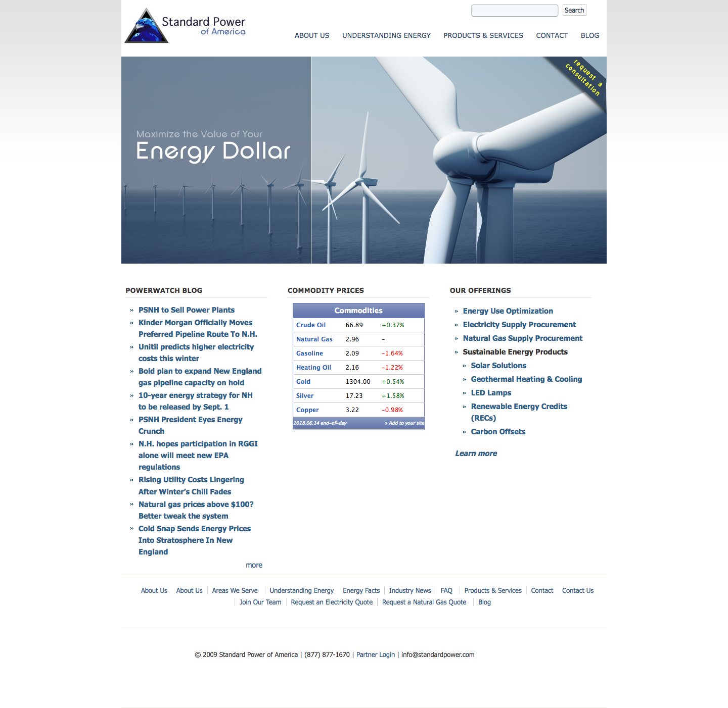
Standard Power is a power brokerage located in Nashua, NH. When we started talking to them they were in the market to have their website refreshed. It had been some time since they had put a fresh coat of paint on their digital storefront.

What we found when discussing their website is that it had been some time since they had updated the majority of the information on their website. The navigation was difficult to understand, and it was lacking mobile responsive features.
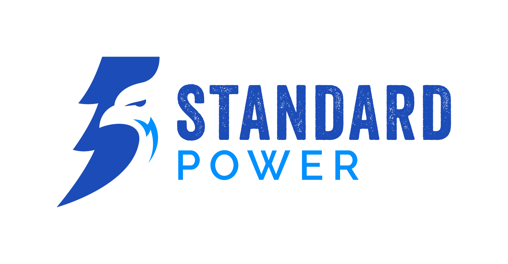
When we began to talk about their site design we had a discussion about their brand. We were able to talk the Standard Power team into letting us take a stab at updating their brand.
Challenge
We had a few items to tackle on this project. We needed to update the Standard Power brand, create appealing designs to communicate energy efficiency and environmental conciousness.
Standard Power expressed that they wanted to keep the eagle from their original logo, this was something they felt needed to represent who they are as an organization.

As you can see there is a lot of detail to consider when translating an eagle to a logo design. Their new logo needed to be succint, make use of their color scheme, and be recognizable.
Their website needed to be organized in a way that was pallatable for the user. The value that they provide as a company needed to be expressed in a better way.
We also needed to find a way to incorporate imagery that supports Standard Power's goal as an organization.
Solution
You can view the end result of our website transformation at www.standardpower.com.
We were able to simplify their navigation and bring elements of their service offerings closer to the front of the website. We emphasized their value by incorporating customer testimonials in a bigger way, both on their homepage and a standalone page.
We also provided Standard Power with a Content Management interface that is scalable and easy to use. They are able to create blog posts and learning pages with ease.
For their brand, we went through several rounds of revision. They were not happy at first. We understand that it's part of the process to find a middle ground between what we are planning and what our customers expect and we encouraged them to trust the process. I would encourage you to ask them about the final result, because I believe they were very surprised to see the final logo we delivered to them.

Benefits
Here's a quick list.
- Improved Branding
- Faster Website
- Cleaner Web Design
- Easier User Interface for CMS
- Mobile Responsive Web Design
Ready to build amazing things?
© Copyright 2018 Mega House Creative Agency